So I have a website with many large images and I have it set up to create smaller thumbnails for responsive images.
I am not sure how to troubleshoot it, but it seems like Kirby is having trouble creating thumbnails sometimes.
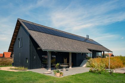
You can see this at Projecten | DAVL Studio | Architectuur, Ontwikkeling, Design. The project ‘Kiosk Frederik Hendriklaan’ is a good example. Kirby is supposed to make a thumbnail that is 420px wide, and it does create an image file, but it’s the full size: https://davlstudio.com/media/pages/projecten/kiosk-frederik-hendriklaan/eb166b274c-1738337938/kiosk_pure-flowers_01-420x-q80.jpg
Could it be that Kirby runs out of memory, or something like that? Am I trying to create too many thumbnails? The website is hosted on a shared hosting platform, so I thought perhaps it cannot handle all of these large images very well.
Locally, where I am using MAMP, it seems to work as it should, creating thumbnails of the correct size.
If it helps, this is the code I am using to generate responsive images:
<?php

// Define default sizes
$sizes = "(min-width: 1080px) 50vw, calc(100vw - 2em)";

// Set target use to default if not specified
if (!isset($targetUse)):
    $targetUse = "default";
    // $sizes = "(min-width: 1080px) 50vw, calc(100vw - 2em)";
else:
    // Define size rules based on specific target uses
    switch ($targetUse):
        case 'articleExcerpt':
            $sizes = "(min-width: 1920px) 332px,
                      (min-width: 1583px) 475px,
                      (min-width: 1540px) 33vw,
                      (min-width: 420px) 50vw,
                      100vw";
            break;
        case 'projectsThumbnail':
            $sizes = "(min-width: 1920px) 16.67vw,
                      (min-width: 1540px) 25vw,
                      (min-width: 1080px) 33vw,
                      50vw";
            break;
        case 'project':
            $sizes = "(min-width: 1540px) 326px,
                      (min-width: 1080px) 25vw,
                      (min-width: 420px) 50vw,
                      100vw";
            break;
        case 'articleImage':
            $sizes = "(min-width: 1584px) 744px,
                      (min-width: 1080px) 50vw,
                      100vw";
            break;
        case 'spanTwelve':
            $sizes = "(min-width: 1584px) 1520px, 100vw";
            break;
        case 'spanSix':
            $sizes = "(min-width: 1584px) 744px,
                      (min-width: 1080px) 50vw,
                      100vw";
            break;
        case 'spanFour':
            $sizes = "(min-width: 1584px) 501px,
                      (min-width: 1080px) 33vw,
                      100vw";
            break;
        case 'spanThree':
            $sizes = "(min-width: 1584px) 374px,
                      (min-width: 1540px) 25vw,
                      (min-width: 1080px) 50vw,
                      100vw";
            break;
        case 'slide':
            $sizes = "100vw";
            break;
    endswitch;
endif;

// Define size mapping for responsive images
$sizeMap = [
    'XXL'   => 2560,
    'XL'    => 1920,
    'L'     => 1540,
    'M'     => 1080,
    'TQM'   => 750,
    'halfM' => 540,
    'S'     => 420,
    'XS'    => 360,
];

// Set default image size for srcset
$srcsetSize = 'S';

// Determine the optimal image size for srcset based on the target size or image width
foreach ($sizeMap as $sizeName => $sizeValue):
    if ($image->width() > $sizeValue):
        $srcsetSize = $sizeName;
        break;
    endif;
endforeach;

?>

<picture class="image">

  <?php if ($targetUse == 'slide'): ?>
    <?php // AVIF and WebP sources for slide images ?>
    <source srcset="<?= $image->srcset('avif') ?>" sizes="100vw" type="image/avif">
    <source srcset="<?= $image->srcset('webp') ?>" sizes="100vw" type="image/webp">
  <?php endif; ?>

  <?php //  Fallback image with lazy loading ?>
  <img src="<?= $image->url() ?>"
       srcset="<?= $image->srcset($srcsetSize) ?>"
       sizes="<?= $sizes ?>"
       alt="<?= $image->alt() ?>"
       width="<?= $image->width() ?>"
       height="<?= $image->height() ?>"
       loading="lazy"
       style="
           aspect-ratio: <?= $ratio ?? 'auto' ?>;
           object-fit: <?= ($contain ?? false) ? 'cover' : 'contain' ?>;
       ">
</picture>
And this is how it’s used in the projects.php template:
<?php snippet('header') ?>

<?php foreach ($page->children()->listed() as $project): ?>
<a href="<?= $project->url() ?>" class="projects-list-link">
  <figure class="projects-list-image">

    <?php snippet('image',
      [
        'image' => $project->images()->sortBy('sort', 'asc', 'filename', 'asc')->first(),
        'targetUse' => 'projectsThumbnail'
      ]) ?>

    <h2 class="projects-list-title">
      <?= $project->title()->esc() ?>
    </h2>
  </figure>
</a>
<?php endforeach ?>

<?php snippet('footer') ?>
I hope this is enough information to be able to diagnose the problem!