Dear friends of Kirby, even beginner questions are seriously answered here, that’s one of my impressions after reading in this forum for a while. What an attentive community, great! And that’s what I am, maybe a little bit more than a newbie and just started my first self-made wordpress site. That worked quite well with a user-friendly theme, but it’s not very SEO-friendly, especially not with indexing my images. Please have a look at papkefoto.de
Now I’m of course very curious whether this site can also be built with kirby. With my current theme it’s easy to place, move and scale images in a grid layout with columns and rows via wysiwyg, for both desktop and mobile, quite flexibleI. Is there anything like it for kirby? It also can be a little less user-friendly, I’m eager to learn.
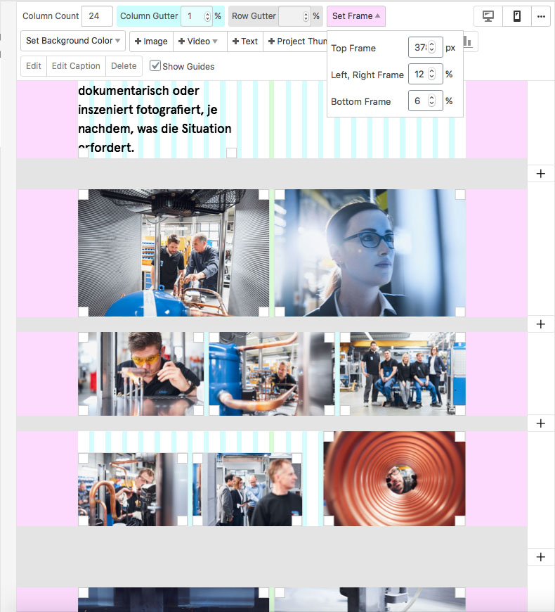
I’m attaching a screenshot that should explain it better.
Kirby is different. It provides enough feilds for you to put most things together with a little thought. I have built image walls like this by using things like range sliders and input fileds to limit the rows and images sizes.
There are no plugins like this but the closest you will get is a custom block for the editor:
If you are familar with Vue, you can roll your plugin or editor block to do this.
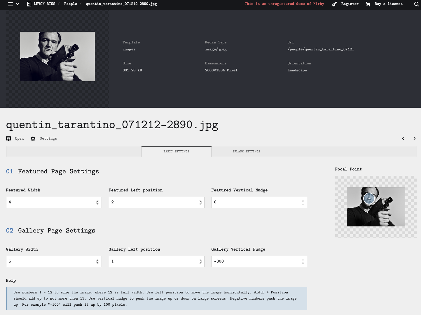
I built a ragged grid by using native feilds and image meta to allow the user to position the images around on the page. The fields generate inline css. you can see the result here:
Hi Andreas, welcome to our forum . These page builder themes are a completely different story compared to Kirby, and if you are indeed looking for something somehow comparable to dragging and dropping stuff around, then Kirby is probably not really the right tool.
KIrby’s editor is in a way comparable to WP’s Gutenberg editor, although it doesn’t come with all the hundreds of blocks WP has added by now.
You can of course extend the editor with your own blocks (and with the few currently available from the community), but that basically means you have to get your hands dirty with code.
If you want to venture out on a completely different experience, you are of course very welcome and we are always here to help!
Thanks for the quick replies! First of all a quick look at my very simple structure, my 3 projects are only shown in the menu, not on a page. ‘Focus of my work’ would be the more appropriate description, presented as galleries. New pictures will be added on top now and then and old ones deleted.
I would like to say that once images are positioned, not much will change. Drag and Drop in an editor is of course a very helpful and quick method for me as a beginner, but no requirement.
I would like to take over the layout of the images, so the different sizes and positions. In WordPress I have a grid with 24 columns on which I align the images in several rows, which results fixed ratios resp. values. Shouldn’t that be done with kirby too? Then without an editor but with css or whatever. How would you start this? Or do you know of any finished or semi-finished solutions?
Depends on the CSS involved, I guess, and the exact layout you want. if you went with a masonary style layout, you will probably just have to get kirby to generate classes.
Something like this wouldnt be too hard to tie into the panel…
You could use the range slider with the steps option to set the number of columns that the image spans.
Altermatively, Kirby has helpers to tell wether the image is landscape or portrait You could automate it based on the image ratio.
As I can see, masonry tries to fill windows or window areas with images in the best possible way. In your example, the aspect ratio of each image will inevitably change, probably also be cropped. Depending on the window size, new image sizes and positions are calculated, the size ratio between the images change and the position too.
What I’m looking for is maybe a little easier. The images are positioned manually on the grid, and all (thus as a gallery) transform with different window sizes by the same factor. And they keep their position in the row. I would also create the layouts for mobile (and maybe for tablet separately) by hand, then writing the given values of the fixed layout in a css.
A constant arrangement of the images and image blocks in terms of content (not technical) is important to me, the individual placing of grafic white space. It’s not very user-friendly, but fortunately it’s my own page, so I can make adjustments in the backend. And as I said, there will be only a few changes to the content or updates.
Maybe the builder plugin with different fieldsets for 2, 3 and 4 images in a row in conjunction with additional info like an offset stored for an image would be a good way to implement this: https://github.com/TimOetting/kirby-builder/
Dear friends, before I ask for solutions, I’ve googled a lot. Unfortunately there’s a lack of knowledge to understand or implement some answers. So please be patient, Kirby is a big challenge for me and I give my best.
As I said, in wp I position and scale each image individually in each of my 3 galleries. And in most cases with different alignment and additional spacing per row - they’re not croped, neither dynamically justified in a row nor in masonry style.
How I understood, in kirby, this would only work with individual layouts (industrie.css, product.css etc.). If I specify my 24-column grid as a basis, there are theoretically 24 possibilities with 1x-24x 4.167% image widths of 100% gallery width (or a little less image width, according to extra space between them). My thought is: each size could be a global placeholder with a fixed % value. Perhaps additionally with defined alignments in the row: top, middle or bottom and aligned to the left or to the right neighbor image - then of course with more placeholders.
Yes, this is anything but comfortable, probably a lot of work by hand, but the result (as on my site) would be worth it to me. Could that be a beginning? How would it look then?
The first one is not really Kirby specific but a question of what sort of HTML Markup and styles you want to use to achieve what you want. Flexbox and CSS Grid would be two options to achieve this. A look at the source code of your WP template might be helpful here (or not).
The second problem is how if and if so – how – you can set this up in the Panel, so that you can change placing of images or replacing images easily with the web frontend without having to touch the templates again.
I’d start with the first problem. Create a prototype with your favorite grid system and hardcoded images.
When that is finished, you will know what information you need to provide for each image via the Panel (basically it will either be a integer for a given span of columns plus maybe an offset).
 . These page builder themes are a completely different story compared to Kirby, and if you are indeed looking for something somehow comparable to dragging and dropping stuff around, then Kirby is probably not really the right tool.