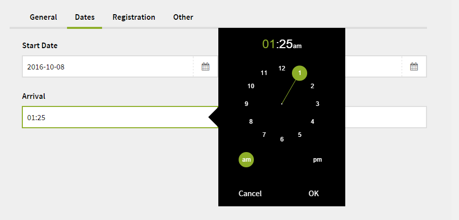
So the default time picker field is a bit difficult to use. There’s a long scrolling selector and the 24 hour time isn’t the easiest to understand for everybody. Here’s my solution to the problem. I based it on the Android alarm clock, which I think is an elegant and interesting solution to the problem. I’d appreciate any feedback you might have. Here’s a photo:
I would also prefer an option whether to use AM/PM or 24 hours. In Germany for example, the 12 hour time is pretty much unknown and only used by people who know English (and then only when speaking English).
And even after so many years, am/pm still makes me think … when using such a time picker, though, it should be intuitive to the user. An option to use one system or the other would be great.
I agree! I’m always like “hm, is AM afternoon or is PM past noon?”.
It’s actually very simple (well, ante and post) but difficult to remember if you didn’t grow up with the system.
I guess I didn’t even think of that, thanks! Quick question though: is the 00 at the very top of the dial “normal”? (as opposed to before the 1.) It seems strange to put it there, but we don’t use 24 hour time here so I’m not sure.
Appearance:
It is a really gorgeous idea! But I have to agree to @lukasbestle and I really would appreciate the way @diondiondion proposed.
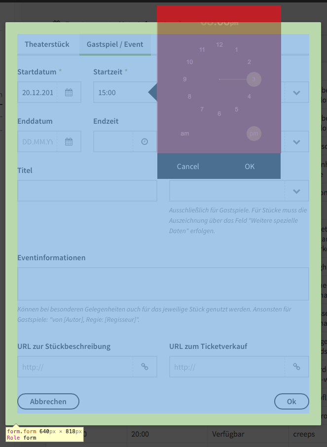
Second: it should automatically choose the direction where it will be shown. I have a field that’s on top of a scrollable structure field (kinda hell thing) and the pikatimer is just partly visible.
Interaction:
I tried to drag the sweet green bubble around the clock but It took the value on drag start. It would be awesome if you could really drag the green bubble but the event listener should prevent it’s action when there was some dragging action.
Code:
I really appreciate your clean code! Great job!
By the way: I haven’t tried to use the field with my smartphone. I guess it won’t work on mobile devices, or? Maybe you could detect this via Javascript or CSS and show this little thing as a centered modal dialog. And of course: then dragging will be something of the joy of use.
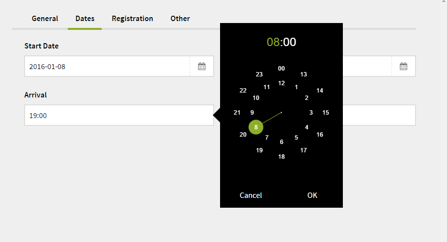
Imagine a user would choose 24 first and then 45. The “display” at the top has to change to 00:45. And I guess you wouldn’t choose 24 when you want to choose 00 minutes. So it’s seems for me better to be 00.
So the clock goes from 00:00 - 23:59 right? What about the actual visual position of the 00 though? The example given by @diondiondion puts it at the top of the outer circle, which seems a strange place to me. It seems like it should come before 1 and that the 12 should be where the 00 is. But if that’s “normal” than I certainly don’t want to mess with it.
@servicethinker: I agree with you, there are, however, use cases where you would choose 24 instead of 00, as in “we are open from 00:00 to 24:00”, or train arrivals at 24:00 as opposed to trains leaving at 00:00.
Edit: if you google 24 h clock images, you will find both and even clocks that go from 0-24/00 in one go.
But generally, I’d prefer 00 for the reasons outlined by @servicethinker
It should be doing this already. Could you clarify a bit more? Do you mean that the control isn’t scrolling with the page?
Yes, I’ve wanted to use a dragging interaction as well, but I haven’t decided on the best way to code it yet. It’s likely to be a large part of the code, so I want to make sure it’s done correctly.
I haven’t tested it, but it should “theoretically” work as long as the screen is big enough to fit the display. A modal would be a good idea in this case, thanks. And that would certainly be an excellent place for the dragging interaction.
If you use the time picker within a structure field, you would end up with a modal on top of a modal, though. From a UX standpoint, this doesn’t sound like a really good idea. Outside of a structure field, it would be no problem.
I briefly tested the pikatime field on an iPhone 6, which seems to work fine.
In a structure field, however, you would have to set the size the structure field modal to something that is big enough to accommodate the time field (no matter if on desktop or mobile). (The Kirby date picker disappears somewhere at the bottom and is unusable on my iPhone.)
Pikatime was updated, this adds support for 24 hour mode through the mode blueprint property. It should also fix most of the positioning issues when near the sides/top of the page. Finally, it now should display on top of everything and not be cut off when inside a structure field. Thanks @servicethinker for your detailed comments, and everyone else for your helpful input!
 , I never really liked the long list of the select field
 Thanks For That
  !
!


 i Like it!