Panel dialog with single selectable k-collection item?

I have a Vue dialog that populates a custom block element with data from a 3rd party API. I have it showing a list of items similar to the built-in image block editor, but I can’t figure out how to make it clickable/selectable (and I can’t find it’s source code). I know about :selecting="true" but that makes it into a multiple-choice list, which is not what I need. I’d like a “radio button” type of list where only one element can be chose, ideally firing a JS event that I can use to manipulate the dialog further.

Here’s what I have today:

<!-- Albums List -->
<k-collection
  v-else-if="isAlbumsStep"
  :items="albums"
  layout="list"
  size="medium"
/>

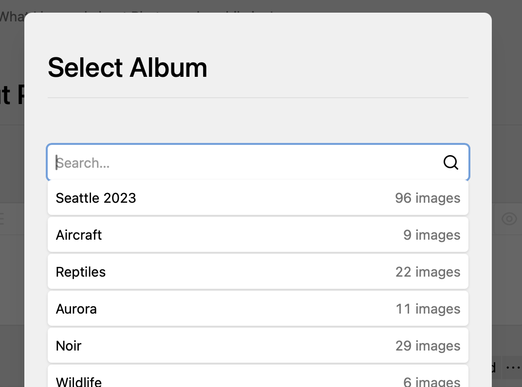
For reference, this is the UX I’d like to imitate:

Thanks in advance!

I guess what you are looking for is this: kirby/panel/src/components/Dialogs/ModelsDialog.vue at main · getkirby/kirby · GitHub, i.e. the choice-input. This is used by the users, pages and files pickers.

Thank you! That did help me a lot!

For future reference: The key elements I missed were the @item="toggle" line in the k-collection node and the template node to render the radio button:

<!-- Albums List -->
<k-collection
  v-else-if="isAlbumsStep"
  :items="albums"
  layout="list"
  size="medium"
  @item="toggle"
>
  <template #options="{ item }">
    <k-choice-input
      :checked="isSelected(item)"
      type="radio"
      @click.stop="toggle(item)"
    />
  </template>
</k-collection>

toggle being a function defined in the methods: section of my plugin .js section.